LeapRate Exclusive… In the retail forex sector, as in many other industries, there are leaders are there are followers.
Never one to rest on its laurels or rely on the status quo even when doing well, Copenhagen based Saxo Bank is clearly a leader.

And beyond the new look (more on that below), Saxo Bank has taken the somewhat drastic step of changing the URL address of its main website – from www.saxobank.com, to www.home.saxo. The change became effective this afternoon London / Copenhagen time. Visitors to saxobank.com are now automatically redirected to home.saxo.
The we-have-a-unique-URL trend is taking shape in several online sectors, as companies look for different ways to differentiate themselves in positive ways in increasingly crowded and competitive markets, such as Forex.
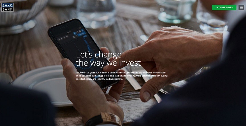
As far as the new look Home Page, Saxo Bank has also gone to the extreme in making it almost all visual, with very few text words or links above the fold. In fact, the only obvious link is ‘Try Free Demo’. Interestingly, there is no ‘Real Account’ button visible.
The company also consolidated its main saxobank.com website and saxoworld.com informational website into the new home.saxo.
The company’s TradingFloor.com research and education website remains the same. As does the Saxo Bank logo. For now.
We’ll have more on all the changes at Saxo Bank in the coming days. Stay tuned to LeapRate.
