This article was written by Adinah Brown, content manager at Leverate.
With a relatively low adoption rate, compared to other industries, the jury is still out in relation to whether your brokerage does in fact need a mobile trading platform. The likelihood is that your traders are not going to choose your brokerage service because you have a mobile offering. However, if your brokerage wants to have its platform accessible to traders at all times, where ever they may be, then you do need a mobile platform. The point being, that it’s not the mobile trading platform itself that’s going to add to your company’s brand image, but rather the pure and practical benefits of just being accessible to your traders at all times.
With this focus in mind, we discuss the critical elements of your mobile trading app so that you can ensure that it’s of great practical value to your traders.
1. Constant flow of updated rates
Of critical importance and a significant challenge is the ability to ensure that your mobile app gets a constant flow of updated rates. Interruptions inevitably occur, either because of technical issues or changes in internet connectivity. On Sirix Mobile, the rates are derived from the LXFeed which is then converted via a web socket so that the rates are then compatible with the web server. This set up ensures a constant flow as long as the trader has continuous connection to the internet.
2. Recovery issues
If the trader moves from WIFI to a 3G network, for example, the mobile application needs to be able to recover all the services and connections so that the user will not be disconnected, but will be able to naturally continue using the platform. Managing problems associated with connectivity is not easy. If a trader has just opened a position, you want to make sure that s/he can smoothly continue from the point that s/he stopped at with the previous connection, which requires a significant degree of technical “gymnastics”. A mobile app should also have an off line mode available, obviously not the ideal, but the underlying objective is to give the trader as much accessibility as possible, no matter what circumstance they may be in. In the off line mode, a trader should still be able to perform a few functions, such as checking charting histories or the history of the open positions that were previously placed.
3. Processing time
It goes without saying that the faster the processing time, the better. The challenge is that it’s not always possible for the processing time to be instantaneous. Instead, once the trader has placed an order, the app should enable the trader to continue working with the application as usual, and only once the processing is complete, does a pop-up come up on his/her screen indicating the result of the transaction (i.e. it has either been successful or was rejected). This notification should only be displayed for a couple of seconds so that it doesn’t interfere with the user experience, the trader should then be able to happily continue with his or her trading activities.
4. User Interface

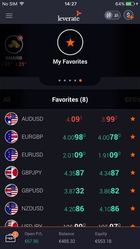
It becomes important to delineate between information that is relevant, less relevant and not relevant at all. The data that is the most critically relevant goes on the home page. On the Sirix mobile homepage, the most popular trading instruments appear on a carousel that can be “spun around”, a plus button is always available from which the trader can place a new trade at any given moment and an account summary is also visible where you can see the balance and P&L.
More information beyond this summary snapshot should then be made available on selection. For example the closed positions are put in the account summary or the varying modes of periodicity which can be selected with just a tap. Finally, you have to delineate the trading data that is least likely to be of use to the trader and not have it available at all, such as unusual instruments and their chart histories.
5. Security
Undoubtedly one of the major hesitations for traders to go mobile is the perceived security. With a well-established precedent, the installation of standalone software on a desk top is perceived as being the most secure and efficient. People are often weary about security on mobile platforms and so prefer to install software on a desktop where they can work within their own “closed” comfort zone. However this preference is just a matter of perception, the reality is a mobile device is really just as safe as a desktop. All the credentials of the user that is saved in the device is encrypted ensuring a secure connection. On a mobile, as on a desktop, a passcode is required to access the device and then again to access the platform. As perceptions develop and technology becomes increasingly safe, the convenience of going mobile is bound to outweigh this hesitation.
